
Simple texture for colour coordination
A simple surface helps you assess the room's colours together. Compare frame, wall and furniture tones to make the fabric a quiet or more prominent part of the interior.
 PLİSE SİNEKLİK VE PERDE SİSTEMLERİ
PLUS · 01
PLISVERA / PLEATED BLIND FABRICS
PLUS combines a simple fabric surface with a wide choice of tones. Its reference presentation emphasises a balanced appearance and understated woven character for varied interiors. Compare nine choices from warm beige to darker shades. Compare your chosen shade with the window frame and surrounding textiles to find a balanced colour combination.
Screen colours can differ from physical samples. Confirm final product matching and availability with PLISVERA.
PLISVERA / PLUS
Compare colours in the large images, then explore your chosen series with frame finishes in the design studio.
A simple surface helps you assess the room's colours together. Compare frame, wall and furniture tones to make the fabric a quiet or more prominent part of the interior.
The PLUS presentation emphasises a balanced appearance between very light and heavy surface effects. Assess its simple texture with colours that coordinate with different interior styles.
Compare all colours in the same pleated form. Selecting a code updates the large image and studio link together; use a physical sample for the final choice between similar tones.
Consider the fabric alongside the window profile and surrounding colours. Compare tones in the design studio and keep a selection record with the series and colour code.
Weight, fabric width, light classification, certification and care information describe the reference collection. Confirm the final product match with PLISVERA before ordering.
Explore how pleated surfaces look in different spaces.
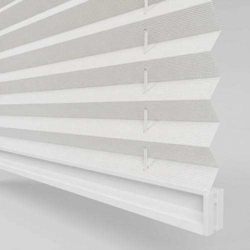 PRESTİGE
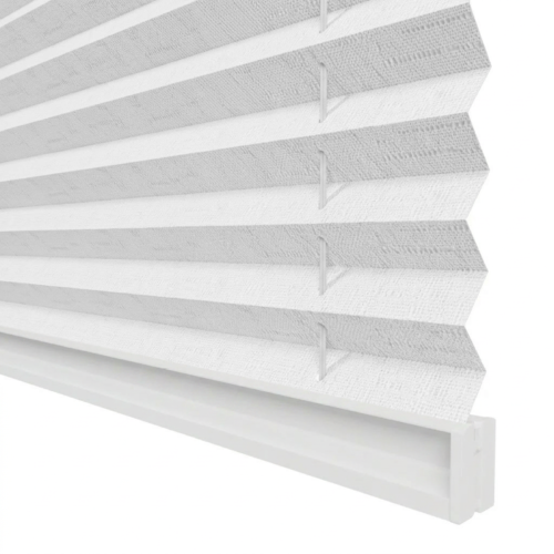 RIPPLE
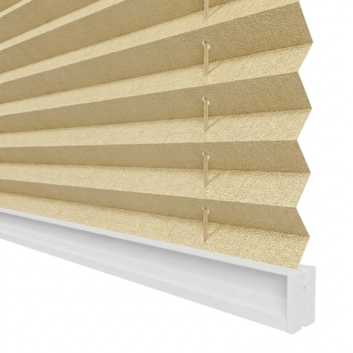 RKG